
Whether it’s remembering important details or engaging with content, pictures outperform text in capturing our attention and leaving a lasting impact. The brain processes images much faster than words, making visual presentations a more efficient way to convey information.
We’ve put together a vast collection of illustrations, graphics, and visual inspirations that go beyond the ordinary, catering to all your creative aspirations. Whether you seek design ideas or need the perfect image size for LinkedIn, this article is your go-to resource for practical insights and valuable assets to elevate your visual content.
Key points
- LinkedIn consists of images literally everywhere, and they play a crucial role in influencing a user’s behavior on your page.
- Images can be generated using both free and paid AI generators. After that, you can create creative collages using tools like Canva or Figma. Figma can also be used to resize banners to the desired dimensions.
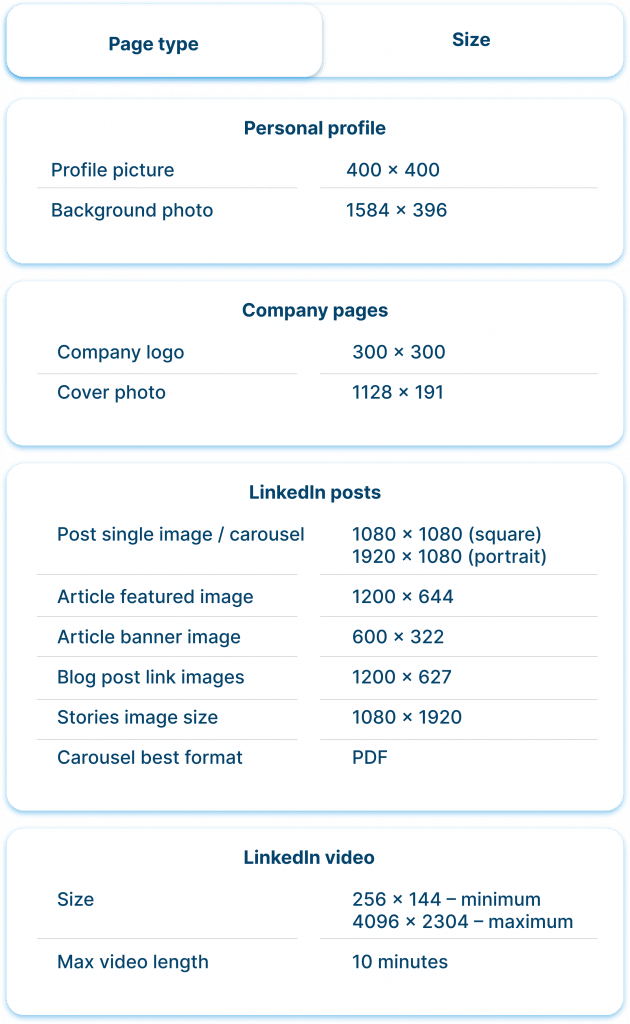
- The recommended vertical image size for LinkedIn is 1200 x 627 pixels. Using this dimension ensures your visuals display optimally and attractively on the platform.
- Upon analyzing examples from LinkedIn, we’ve found that users often use stock images for articles and profile headers. For event photos, it makes sense to create informative collages with the event title and participant photos.
- The recommended square image size for LinkedIn is 1200 x 1200 pixels.
- Try using our spreadsheet to figure out an ideal LinkedIn image size based on content type. Below, we’ve prepared an image cheat sheet where you can find all the current dimensions. You can also refer to the sizing cheat sheet in LinkedIn’s help section.
Practical tips to nail your LinkedIn visuals without hustle
Incorporating Midjourney and other image generators
Elevate your LinkedIn profile with eye-catching visuals effortlessly by using AI-powered image generators like Midjourney. These tools can help you create unique and professional-looking graphics in a matter of seconds.
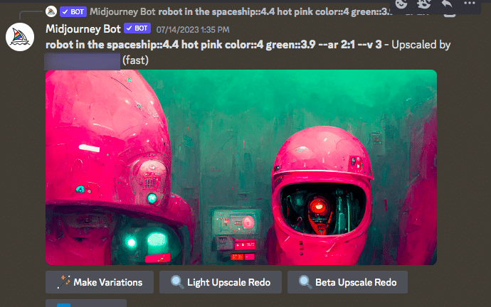
For example, you can generate striking quote cards, impressive banners, or engaging infographics that enhance your profile’s visual appeal and leave a lasting impression on your audience.
Resize and crop photos in Figma
Enhance the visual consistency of your LinkedIn posts and profile by mastering the art of resizing and cropping photos. Learn how to resize images in Figma without compromising on quality.
Figma is a vector-based design tool, so resizing images within the canvas will not result in a loss of quality as long as you maintain the aspect ratio and avoid stretching the image beyond its original dimensions.
Simply follow these steps:
- Download Figma and open the application.
- Create a frame of the desired size, for example, 1584 x 396 for your profile background.
- Import the image for the banner by dragging and dropping it into the frame.
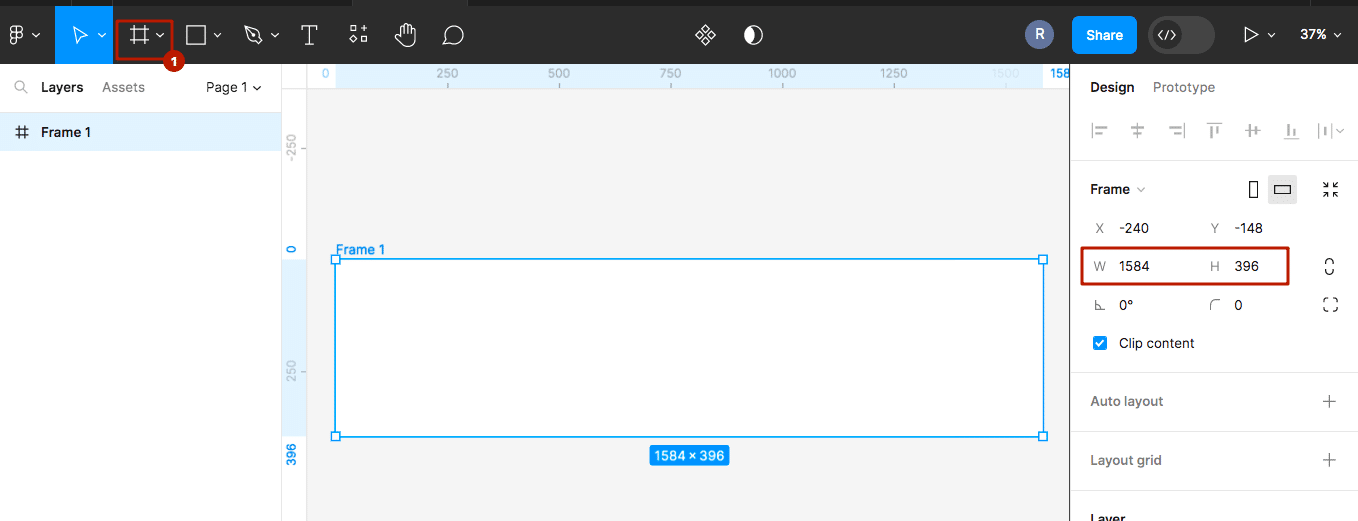
Adjust the image to fit within the frame boundaries.
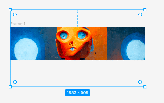
Save your design and download it. Now you can confidently use the visual of the correct size on your social media.

Enjoy simple creativity with Canva
This user-friendly online editor that offers a wide range of pre-designed templates organized by categories such as technology, digital marketing, and design. With Canva, customizing your visuals is a breeze. Simply choose the template that suits your project, and effortlessly select images, fonts, and text.
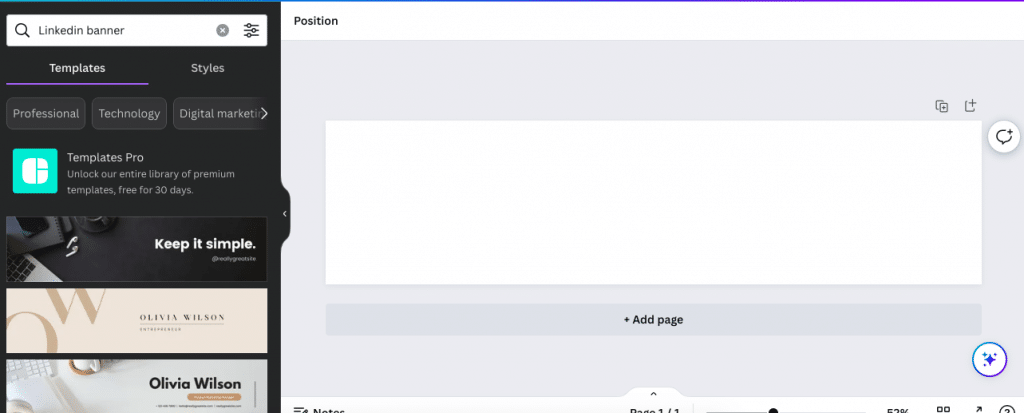
The best part is that Canva takes care of the sizing for you, ensuring your banner is already in the correct dimensions.
Explore free high-quality stock photos
Save time and money by accessing a plethora of high-quality stock photos from websites like Pexels.com. These platforms offer an extensive library of images that you can use as backgrounds for your posts or as supplementary visuals to complement your content. For instance, you can find stunning nature landscapes, vibrant cityscapes, or elegant office settings to suit the tone of your LinkedIn updates and captivate your audience.
Unsplash is another fantastic resource for captivating stock images that can elevate the visual appeal of your LinkedIn profile. Whether you need professional headshots or eye-catching illustrations, Unsplash has a wide array of images that cater to various industries and themes.
LinkedIn banner image size & ideas
Banners for personal profiles hold immense significance, especially in the context of LinkedIn’s user experience. These banners serve as a powerful visual introduction, leaving a lasting impression on visitors to your profile. In the LinkedIn UX, the recommended LinkedIn profile header image size is 1584 x 396 pixels.
Examples from LinkedIn
After studying numerous profiles for this article, we have identified some patterns in how users utilize banners for their profiles.
#1 Showcasing brand identity through banners
In the image below, you can see how a company recruiter uses graphics with the company’s logo in their banner. This can be a professionally designed banner created by designers specifically for them. However, even if you don’t have access to designers, you can easily create a similar banner using stock images, logos, and Canva within a few minutes.
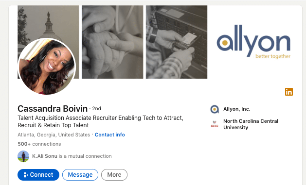
As mentioned earlier, Canva provides ready-made templates where all you need to do is add your photos from the gallery.
Even with a stock image, such a banner will appear customized and add a unique touch to your profile.
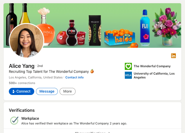
In the next example, brand identity is also showcased, but this time through products. Creating such a banner might be more challenging for beginners. However, you can use the free service Remove.bg to crop any product for the banner. This kind of design may work better than a logo because visitors to your page will immediately understand the product you represent.
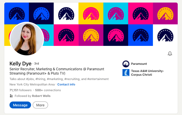
In the example below, you can also see how brand identity is reflected through the profile banner. This is a profile header of a senior recruiter at Paramount. You can take note of this idea and create a similar collage using pop art style with logos for your profile banner.
#2 Use visuals reflecting your interests
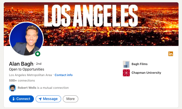
Be bold and let your personal interests shine through your banner. As seen in the example below, a sales professional uses a photo of their living and working location. It’s a simple idea to execute, and you can easily find or create images that align with your passions and personality.
#3 Many people use stock images
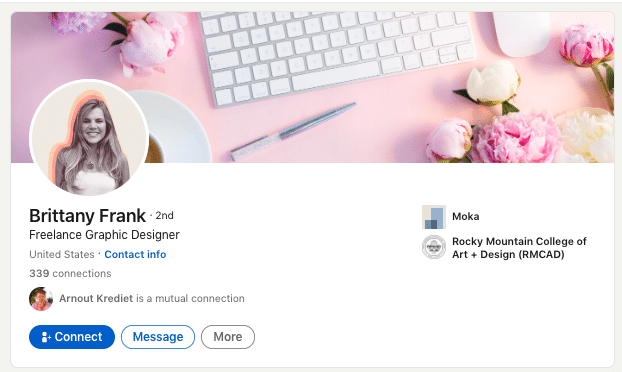
Even top-ranking professionals often use stock images. It is the simplest and quickest way to fill the space. Remember that this is the first screen people see when they open your profile. Therefore, choose an image that reflects your mood and persona, ideally complementing your profile photo as shown in the example below.
#4 Try using vector graphics
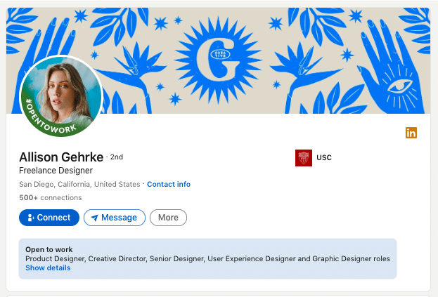
An uncomplicated vector pattern can appear more stylish than a realistic photograph. In the example below, we see a designer using an illustration. Even if it’s a unique image, you can find something similar in high quality at Freepik.
#5 Use quotes for positioning
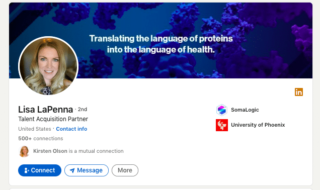
You can make a downloaded image unique by simply adding text on top that reflects your company’s mission. It can be a single sentence that conveys the brand’s value, as shown in the example below.
LinkedIn profile image size & ideas
LinkedIn portrait image size can be 400 x 400 pixels and more to keep the square aspect ratio. However, even if your photo is larger than this size, you may not need to crop it because LinkedIn has a built-in editor.
#1 Try LinkedIn themed frames to attract attention from searches
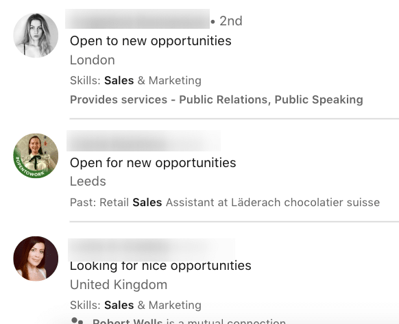
Something as small as your profile picture (since it appears small on the screen) can make a significant impact on your career or sales. A well-chosen photo can also increase profile visits from search pages. As seen in the example below, people from search results only see the main photo.
By comparing the three examples from the search results (see photo below), where people are actively job hunting, we can conclude that LinkedIn-themed frames can help you visually stand out.
#2 Try black and white photos
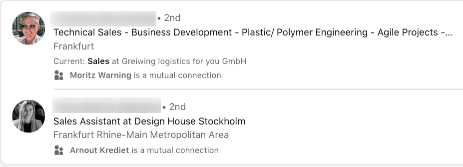
We also noticed a trend where some users opt for negative or black and white photos. This approach helps eliminate distractions from the photo and can help you stand out amidst the sea of colorful images in search results. As shown in the example below, black and white photos exude a professional and stylish vibe.
#3 – Just Smile
The most foolproof option is to choose a photo where your smile reaches your eyes. Such photos, from a psychological perspective, attract viewers to click on them.

As seen in the example below, both male and female portraits exude a warm and inviting charm. It could be a simple selfie against a solid-colored background.

LinkedIn article header image size & ideas
Optimal image dimensions for articles are 1200 x 644. However, keep in mind that in the featured section preview, users will see a smaller version of the image, which is 600 x 322. So, when designing your article header image, make sure it looks good and conveys the necessary information even in this reduced size preview.
LinkedIn featured image and its size
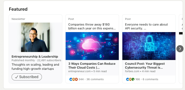
The featured section includes all the posts, article links, and other content that you choose to display. In terms of size, it’s a reduced copy of the photo you used in your post or article.
This section is the first thing viewers see when they visit your profile, making it even more critical than your posts.
From here, you can direct visitors to important articles, posts, or external landing pages. Essentially, the images you use for these posts are the visuals you utilized in your articles, newsletters, or regular posts. It can also be an image for a link preview if it leads to an external article.
Examples of captivating article header images
The image you use for your main content matters. It can directly intrigue people to click the link, leading to increased views.
As we observed from examples of leading users and top voices on LinkedIn, people easily use stock images. So, don’t worry if you don’t have a professional designer; you can do the same.
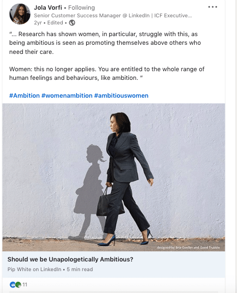
The main hack we discovered, and we urge you to keep in mind, is to use an image that emotionally relates to the text’s meaning. People will intuitively focus on the visual first, then the headline, and take the key action – reading the text.
LinkedIn background image size for a company page & ideas
As we brought up in the table at the beginning of this article – the best header dimensions for a business page is 1128 x 191.
Along with your logo, this visual can serve as a means to attract clients and even function as a promotional banner. Let’s take a look at some examples.
Examples of modern cover images for company pages
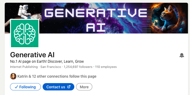
#1 Don’t Forget About AI Image Generators
It’s fascinating to think that your company profile could feature visuals created by generative AI, designed by robot designers. However, let’s explore another exciting option presented below; seamlessly incorporating a collage of images. By mixing these images in Figma, Photoshop, or Canva, you can craft a one-of-a-kind and impressive banner that truly stands out and reflects your brand’s uniqueness.
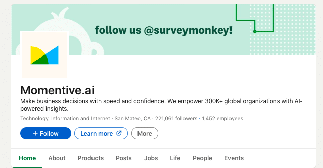
#2 – Add a CTA for following on Instagram
As shown in the example below, cross-promoting your channels can be effective. Redirect anyone who discovers your company page on LinkedIn to your Instagram, especially if you regularly publish engaging and entertaining content there. Simply include your Instagram username in the company page header, so people can easily find you.
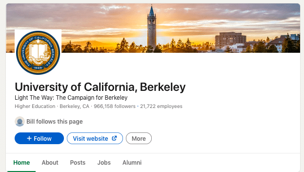
#3 – Use real photos
In the example below from a university’s company page, you can see how a photo serves as the header. Such images could portray the facade of a building, office, or any other presentable view of your company. This idea works well for businesses where design and physical appearance are important for branding.
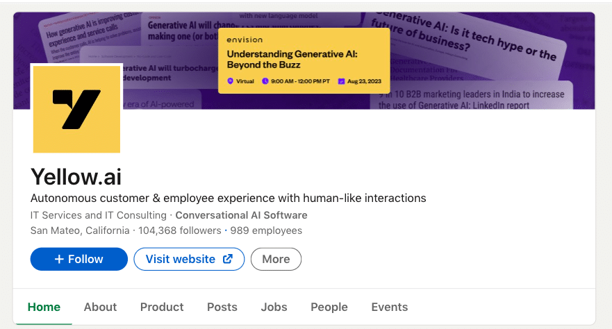
#4 Promote events in the profile header
Using your profile header as an attractive event cover can be equally effective. After all, people who find your company page in search results will immediately learn about your brand’s event. This idea appealed to us, and we suggest trying to gather event leads through a photo header.
#5 Create a Stylish Collage
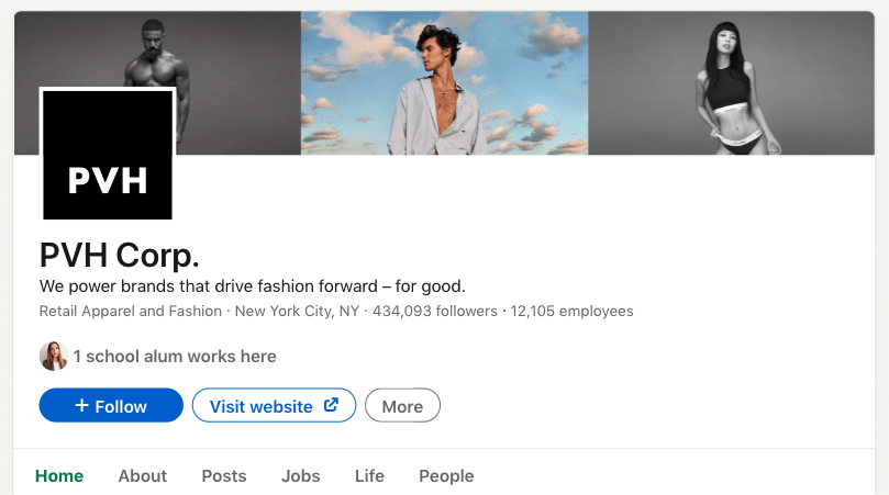
Below, we provide an example of a header not for a technology industry, but for a physical retail business. In certain niches, the header can play a crucial role in shaping your brand’s image and should align with your brand’s identity. In this example, a stylish collage of black and white and colored photos showcases the brand effectively.
Other visuals that influence your digital brand image
Examples of LinkedIn event image size
Looking at these examples, you can better generate ideas for your own event. We noticed that visuals for events play a decisive role, and event creators indeed put in effort. Take a look at a few ideas.
#1 Include photos of key speakers
If your event involves interviews or important guest speakers, don’t miss the opportunity to feature them in the event header. As shown in the example below, this kind of header appears more engaging with real faces, as they inspire trust and interest.

#2 Consider how the event header looks in search results
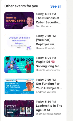
You may have noticed that when people click on an event, they see recommendations for other similar events. Therefore, if your event appears among them, the header should be eye-catching. As we see in the example below, the title and subtitle should be clearly visible in the preview, and using a speaker’s photo can be effective. This approach will attract more attendees.
#3 Be bold and extravagant
The company page header example below can be an excellent inspiration. You can generate a background using AI and include a guest’s photo to add uniqueness to the header. Additionally, always include the event’s title or headline in the header.

LinkedIn link preview image size and examples
Link previews are usually the main images used in an article or content piece that the link leads to. The recommended LinkedIn link image size is 1200 x 627 pixels. These preview images play a crucial role as they have the power to attract viewers’ attention, encouraging them to click on the link
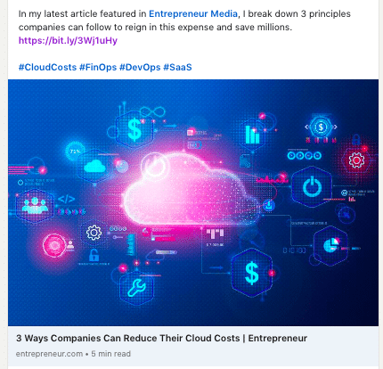
In the example below, we can see that such an image can be downloaded from a vector stock or generated through AI. At the same time, the image effectively represents the theme of the article, clearly indicating that the article is about cloud solutions.
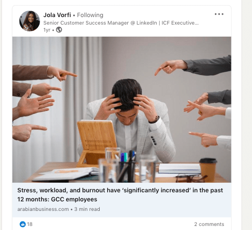
In the next example, we can also observe how a simple stock photo perfectly complements the theme of the article.
You can make your LinkedIn posts and articles stand out by being more intentional with your visuals. Consider the following strategies:
- Embrace creativity with AI-generated images.
- Craft straightforward infographics using tools like Figma.
- Create collages that blend your own content, such as photos of people, with downloaded visuals.
Final tip: Create custom images in LinkedIn mass messages
Take advantage of Linked Helper’s seamless integration with Hyperize to elevate your communication with captivating visuals. With this feature, you can create custom banners that feature eye-catching images for link previews and then overlay them with dynamic text variables.
For images in LinkedIn messages, it’s recommended to use a size of 1200 x 627 pixels. This size ensures optimal display and quality when sharing images in your LinkedIn messages.
As a recruiter, imagine crafting a personalized message for a potential candidate, such as a Sales Manager. You can include a custom Call-to-Action (CTA) tailored to the candidate’s skills and expertise. For instance, you could use a CTA like ” {Name}, unlock your potential as a Sales Leader” or “{Name}, join our winning team and drive sales success.”

